Zenergi
Energy + Freedom
2019
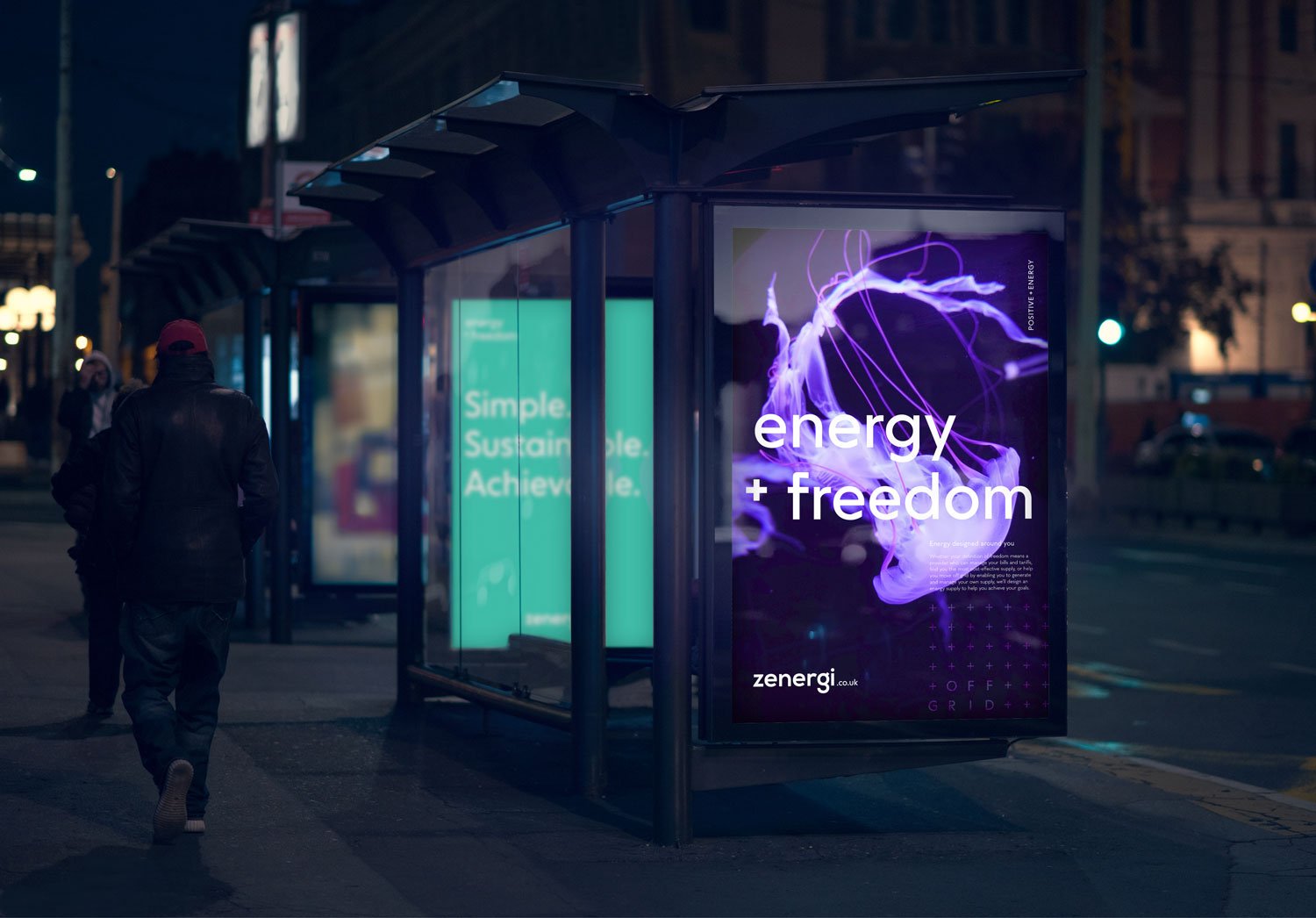
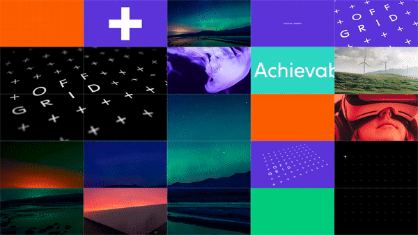
Zenergi’s proposition was admirable; helping customers reach a more cost-effective, sustainable way of managing their energy supply and costs. The task was to help them clearly define that proposition with a rebrand and tone-of-voice that put their green credentials front and centre. The project consists of brand guidelines, print assets, out of home advertising and animation, designed to demonstrate that there is an alternative to the way businesses procure and consume energy.
LEAD DESIGNER
We set about designing a visual identity that would to speak to customers within a changing market. Zenergi are challenging customers to think differently about how their energy is supplied and consumed, so this swayed me to think differently about the corporate colour palettes and overhaul what is typically seen within the energy provision industry. Subsequently, the brand colours are ambitious, young and energetic.
ZEN01 / →


The design overhaul showcases a visual language that is consistent across all channels and touch-points. The interconnected plus (+) symbol is designed as part of their Energy Freedom campaign and apart of their message for positive energy procurement, which can be used separately and collectively throughout the identity.
ZEN02 / →